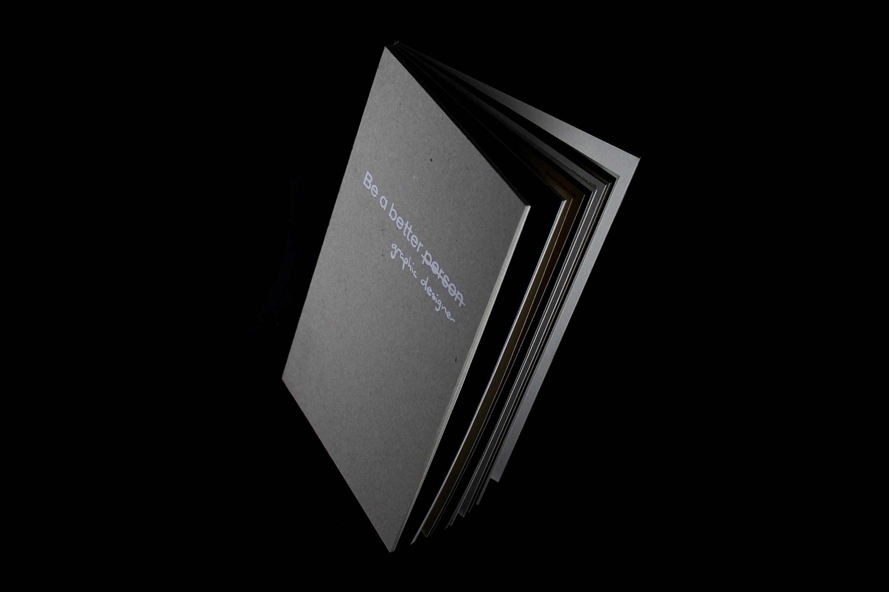
ACO SANS
Year: 2023
Client: Australian Chamber Orchestra
Creative Direction: Moffitt Moffitt
Collaborator: Matter of Sorts
Category: Custom Typeface Design
Year: 2023
Client: Australian Chamber Orchestra
Creative Direction: Moffitt Moffitt
Collaborator: Matter of Sorts
Category: Custom Typeface Design
All imagery of font in use is credited to Moffitt moffitt
About:
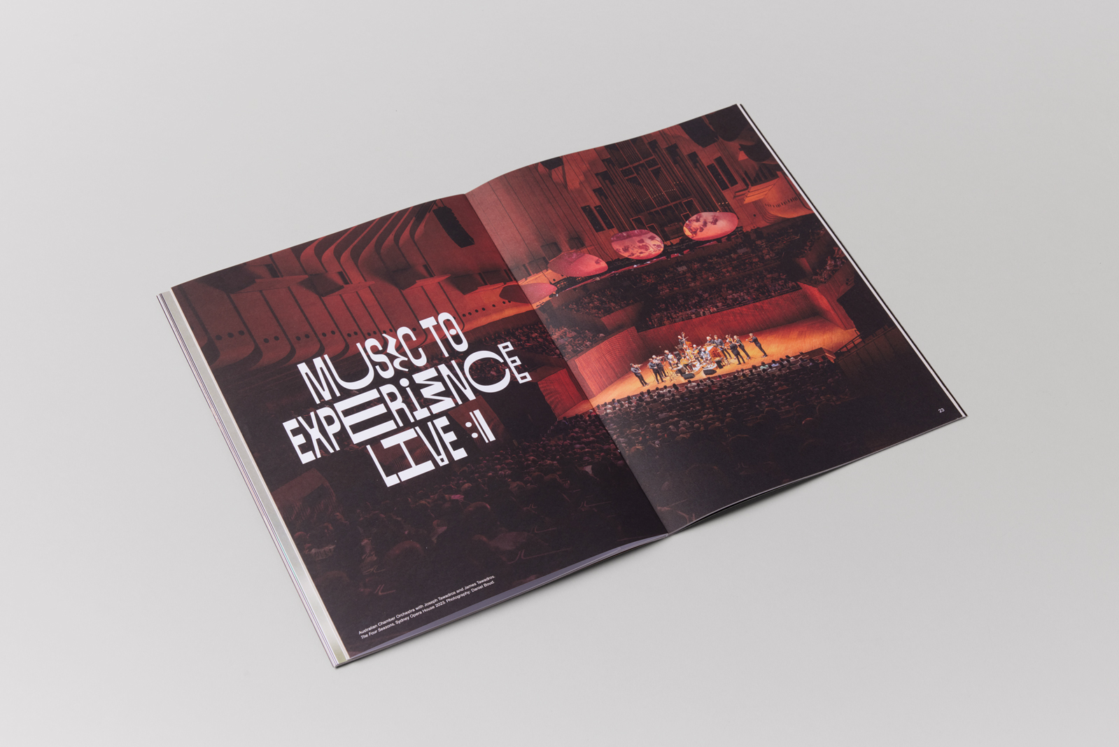
A custom all-caps typeface for the Australian Chamber Orchestra for their 2024 season campaign, art direction by Moffitt Moffitt.
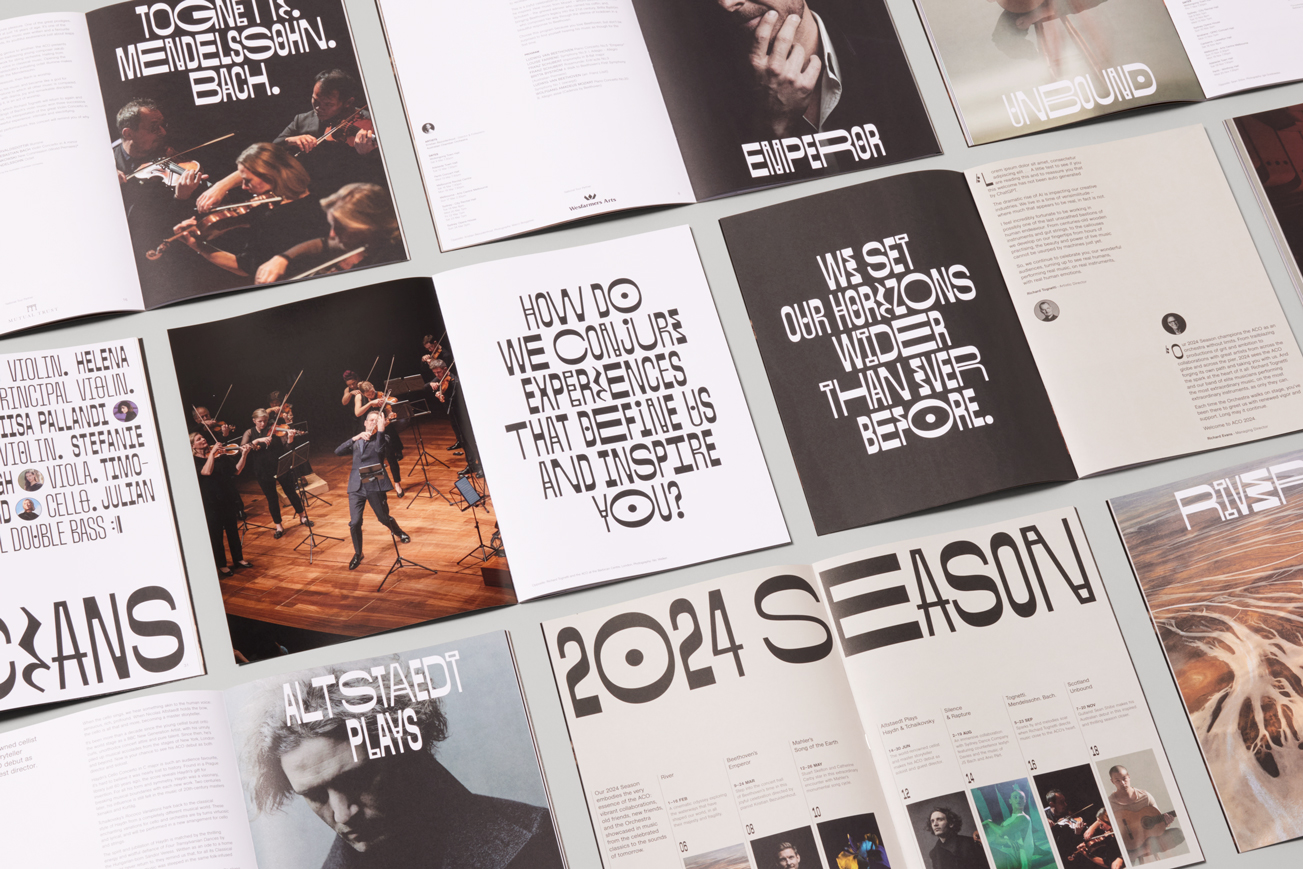
The 2024 ACO season campaign shifted towards a more visual photographic style with emphasis on stylised musician portraits, in combination with a intricate custom typeface based on music notations.

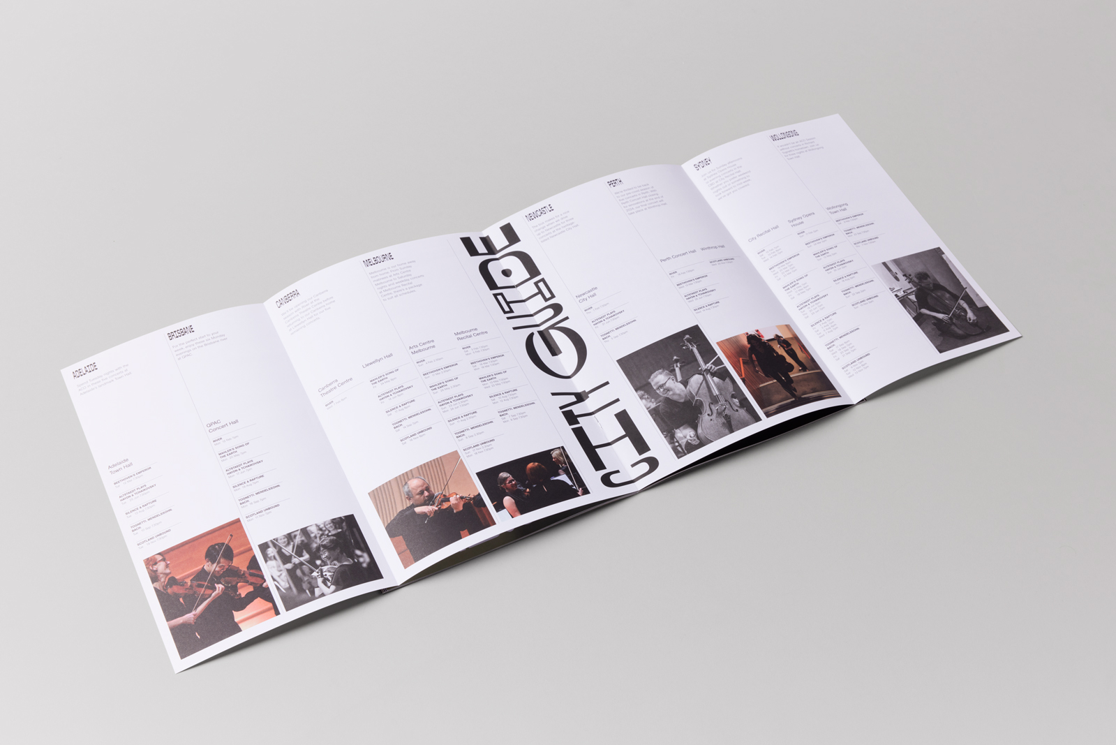
Visual Style:
These widths were based on the premise of based on quaver, crotchet, minus and semibreve. The reverse contrast dictated that all horizontals would be thicker than the vertical strokes mimicking that of music notes.
Results:
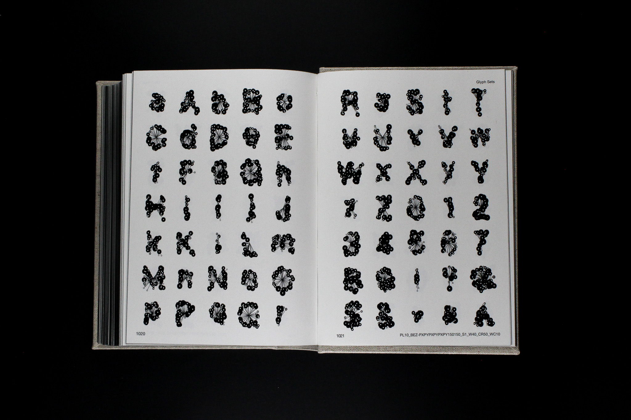
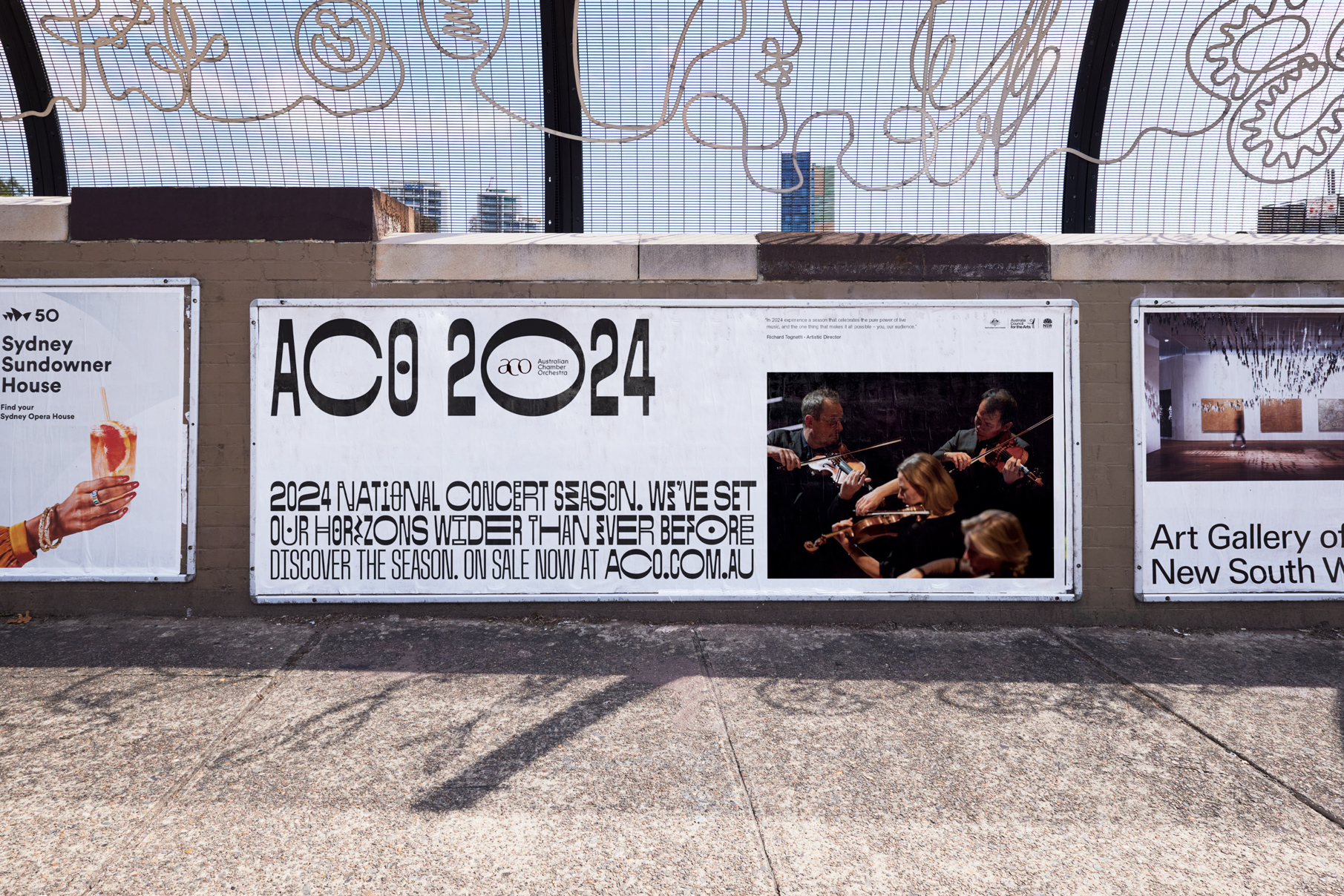
ACO Sans is a completely custom typeface with 4 widths and up to 7 alternates per character, with a total of 1482 glyphs used in all ACO 2024 season print and digital collateral.
ACO Sans is a completely custom typeface with 4 widths and up to 7 alternates per character, with a total of 1482 glyphs used in all ACO 2024 season print and digital collateral.
